5 Quick Tips for Your App Landing Page
Want to know the tips for your App Landing Page? This guide by Vizteck will help you through it all!

Technology

June 24, 2016

Mah Noor

Do you know what is a landing page? It is a definite part of any application. Your landing page is what presents your idea in a precise and minimal way. Every application has its own dedicated landing page and the only purpose of it is to bring visitors to the page and then convert them effectively.
A landing page could be your home/front page, or it may be one of your pathway pages. Your landing page is, what you are presenting on a single page with a certain call to action for what you are offering. In fact, it is the solution to the viewer's problem.
Let’s review some of the quick tips for your app landing page
- Responsiveness
- Email integration
- Map your services
- Make it functional
- Effective Call to Action
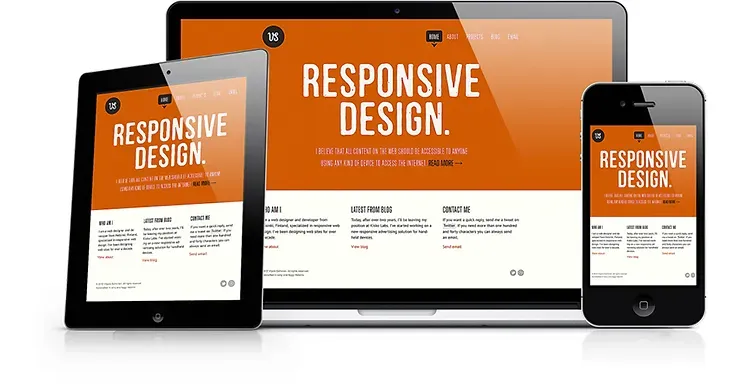
The responsiveness of your landing page is related to the content. Your page is your container, and your content is like water in it. Make your content responsive enough to pour it into any container (in this case it is your web page) that device you are using, i.e., a smaller or wider screen. It should be responsive on mobile or on a laptop screen.
Your page must interact with the user, be easily readable, with proper navigation controls and resize across a wide range of devices. Bootstrap has a ‘meta’ tag for making your page content responsive. Your content will automatically adjust according to the screen size.
We are providing a solution for mobile and web applications. For example, we provide responsive web and mobile apps to our clients like Storechat.net.

This is one of the most important components of a landing page especially when you have not launched your product yet.
Using email integration tools like Mailchimp, you can capture the email address of the visitor. This email is like gold if you manage it right.
Tools like Mailchimp and constant contact allow you to automatically send emails to your visitors at specified times e.g. after 1 week after 2 weeks. If you use it effectively, you can build a follow-up to your product launch or if your product is already launched, you can nurture them to a specific point where they are ready to convert to your customers.
You have to know what people are looking for from their perspective. Guide viewers through simple tips and convert them by inspiring them through your products, i.e., services/solutions you are offering.
Give your visitors a feel as if they have landed on the right landing page. Monitor thoroughly what he is performing on your page and what motivated him to make up the goal. If they are bouncing back without any trigger, then wisely think about what should be there, create a sense of recognition.
If they landed by chance, then make them stick to your page by engaging them with your content. Like, ask him to follow the steps to make him stick.
Be consistent while branding yourself. Be well-coordinated, and professional in your way. Make it even more interesting for him to explore further and check out for details. In return, it generates sales for you.
The most interesting thing you can do is to make it functional. How you show or present yourself on one page. Guide your viewer in such as way that a single look will clear the whole story. Try to be focused on what is most important in your domain and add it to your landing page.
Another important aspect of functionality is ‘make it minimal’. Your landing page should not have many functionalities in it. Make it minimum enough to relax your viewer and make him feel easy to work with it rather than a lot of functionalities that are going to mislead him. Moreover, its sole purpose of it is lost.
For example, add a video on your landing page that brand yourself. People will love to see the video because it is more catchy and easy to understand.
Call to action is an important part of your app landing page. It is the result of visitors’ excitement while exploring your web page. It will define your decision, what are you looking for, and what you want to achieve. If you are a good supplying company then your call to action, i.e., maybe ‘Order Now’ returns sales for you.
Make your app landing page persuasive and make it tempting that will direct them to the next step and i.e., sales. If you are presenting your android app on your landing page then, your target is to ‘download’ the app. Present your app in a way that users will definitely download it.
Another call to action is social media share buttons. Make it clear in your mind that first prioritize what you are putting into your page. Don’t overcrowd your landing page with many calls to action. It will create a mess and make your viewer nervous.
Let me wrap up the whole discussion; your app landing page is your identity. First, plan what you want to explore on your page and then plot them in the right manner.
Vizteck Solutions is providing web and mobile solutions for over 9 years for businesses and startups. We always tried to make our landing page considering these tactics. We offer a solution with a very effective landing page with Mailchimp integration for a fixed price of $999.
If you have any queries, then contact us at sales@vizteck.com.
